In the 06 design sample, we show you an example of a creative analytics map.
The 06 design
So, in this example, we focus on a real before and after design. Initially, we had a pie chart in a PowerPoint presentation, showing top 10 company sales by state. In that pie, we only show the percentages, which is okay.
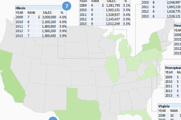
One of the directors wanted to view a different display of this data. Therefore, we decided to create a map with tables of sales figures and percentages for the top ten states. They loved it!
Guess what? We use Excel to populate tables, and then bring it into PowerPoint. So, when the data in Excel updates, the tables in PowerPoint also updates.
Anyhow, let us take a look at the before and the after designs.
Before design
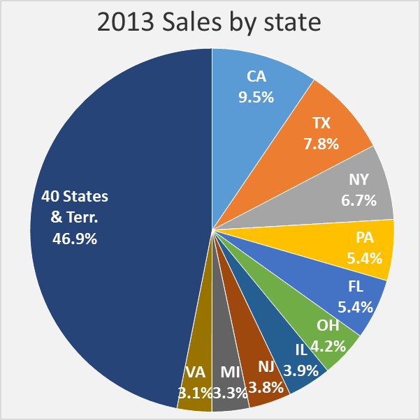
As you see, just a regular pie chart. It gets the job done. Personally, we like the rule of having only six series or pie slices on a pie chart. After that, we think you should use a column chart.
After design
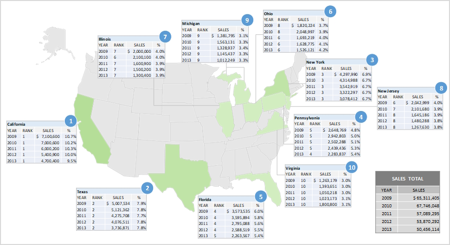
Now, in the after design, we create a set of tables in Excel, and bring them into PowerPoint. Although this map was created in 2015, it still works well today. Well, we make it even better today.
Related
- 04 design sample
- 05 design sample
- PowerPoint circular puzzle designs – How to
- Triangles inside the octagon – PowerPoint tutorial