Overall, our Excel chart library contains all types of graphs for you to view and use.
Our Excel chart library
Before we even start, let us say, we use the terms “chart” and “graph” interchangeably. For the purpose of this library, they both mean the same thing.
Note: Unless otherwise noted, all graphs in this library are less than 45 kilobytes in size. So, enjoy!
Requirements: Excel 2007 or higher or compatible.
By the way, we know we are going to have to explain some of these charts. Therefore, please be patient while we compile everything, in this chart library.
For work
In addition, many of these charts are common to different types of businesses. Thus, we suggest you use them at your job. For the most part, they are all set up for you. So, all you have to do is, plug in the numbers. On the whole, it will make your work-life easier.
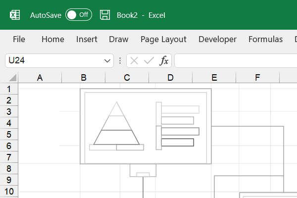
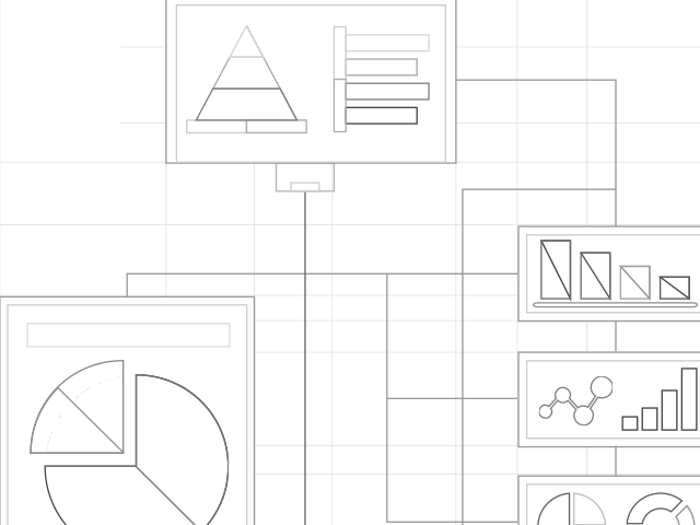
The charts
So, these are the charts we have for you to download at any time.
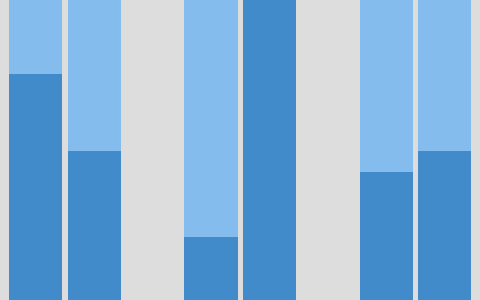
Area difference
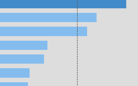
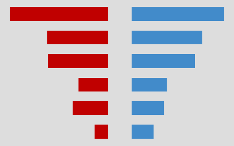
Bar average 2
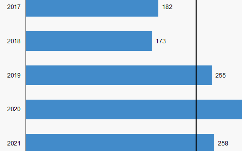
Bar average
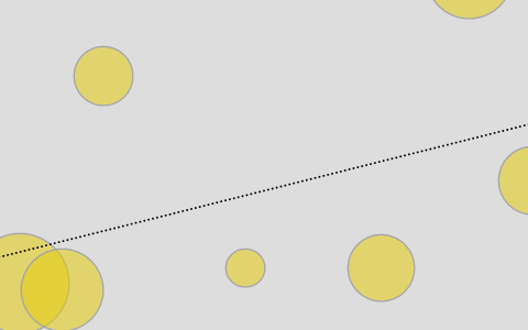
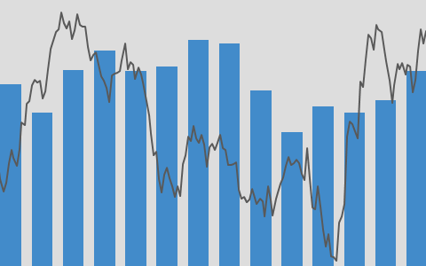
Bubble trend line
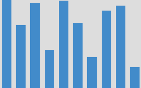
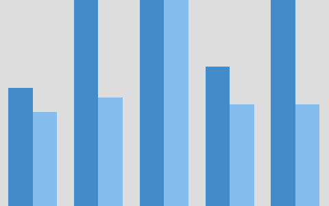
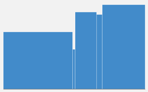
Column
Column scatter line
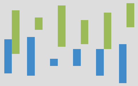
Column high-low
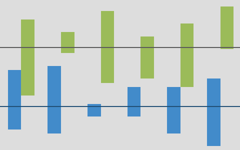
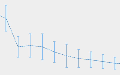
Column high-low average lines
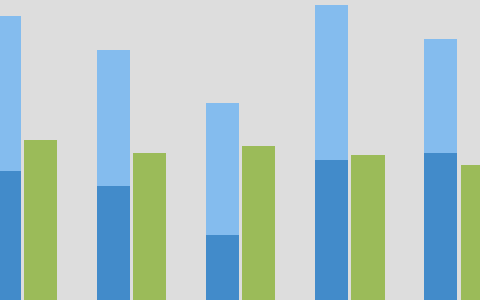
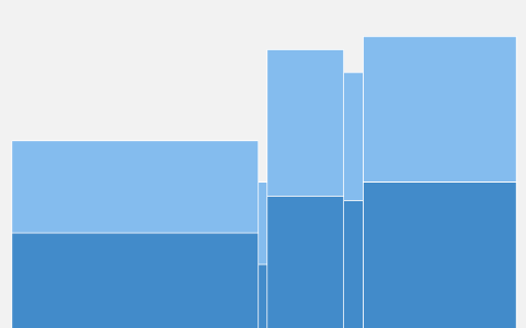
Column and stacked column
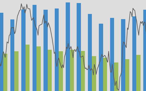
Column multi-line axis
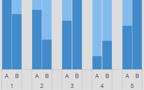
Stacked column, stacked column
Column on separate axes
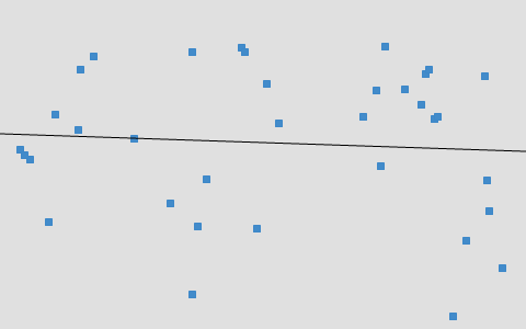
Column average line
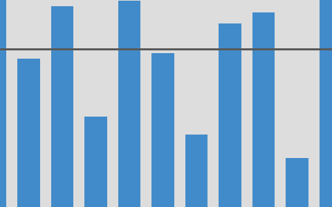
Column scatter line
Line high-low bars
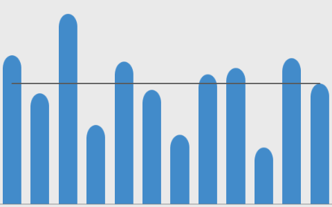
Scatter dots
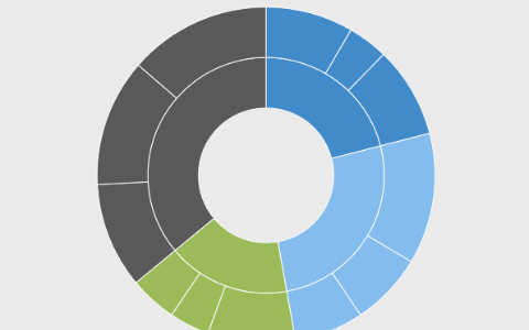
Sunburst
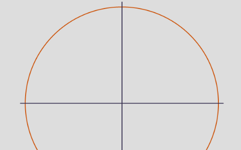
Unit circle
Remember, we are always working on this page. Therefore, make sure you maintain contact with us. Also, continue to come back to see the latest updates.
Sheet charts
So, sheet charts are not really bonafide Excel graphs. Instead, they are symbols and text embedded directly on the worksheet. Therefore, you cannot move them around, as you would do an ordinary chart.
On the other hand, with most of our sheet charts, we include a snapshot that you can move around. Also, it updates when the sheet chart changes.
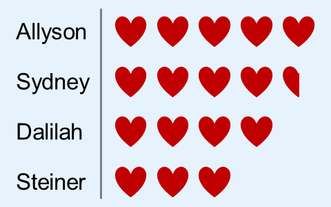
Hearts column
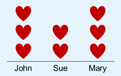
Hearts row
Special charts
With our special charts, we include some creative stuff on a regular chart to make it more exciting.
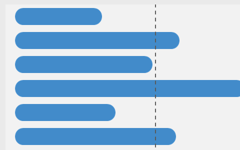
Pills bar with average line
Stacked pills bar
Marimekko – One level
Pills column avg line
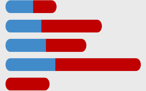
Butterfly
Marimekko – Two levels
Box
More information on charts
As you may know, charts help you show data and information to your audience in a more visual manner. In addition, it tends to keep the attention of your client. So, you can also learn how to create a chart from scratch. Also, you will have a better understanding of the process for creating a chart.
There are various apps that allow you to create charts. Of course, Microsoft Excel is a very popular app for working with charts. However, you can use Google Sheets, Apache OpenOffice, or LibreOffice to create charts. For the most part, they are compatible with Excel.
Related
- Create target line for Excel charts – Quick snapshots
- Excel QAT – Quick access toolbar
- Link cells to shapes in Excel – How to
- Protect Excel files with open password – Snapshots