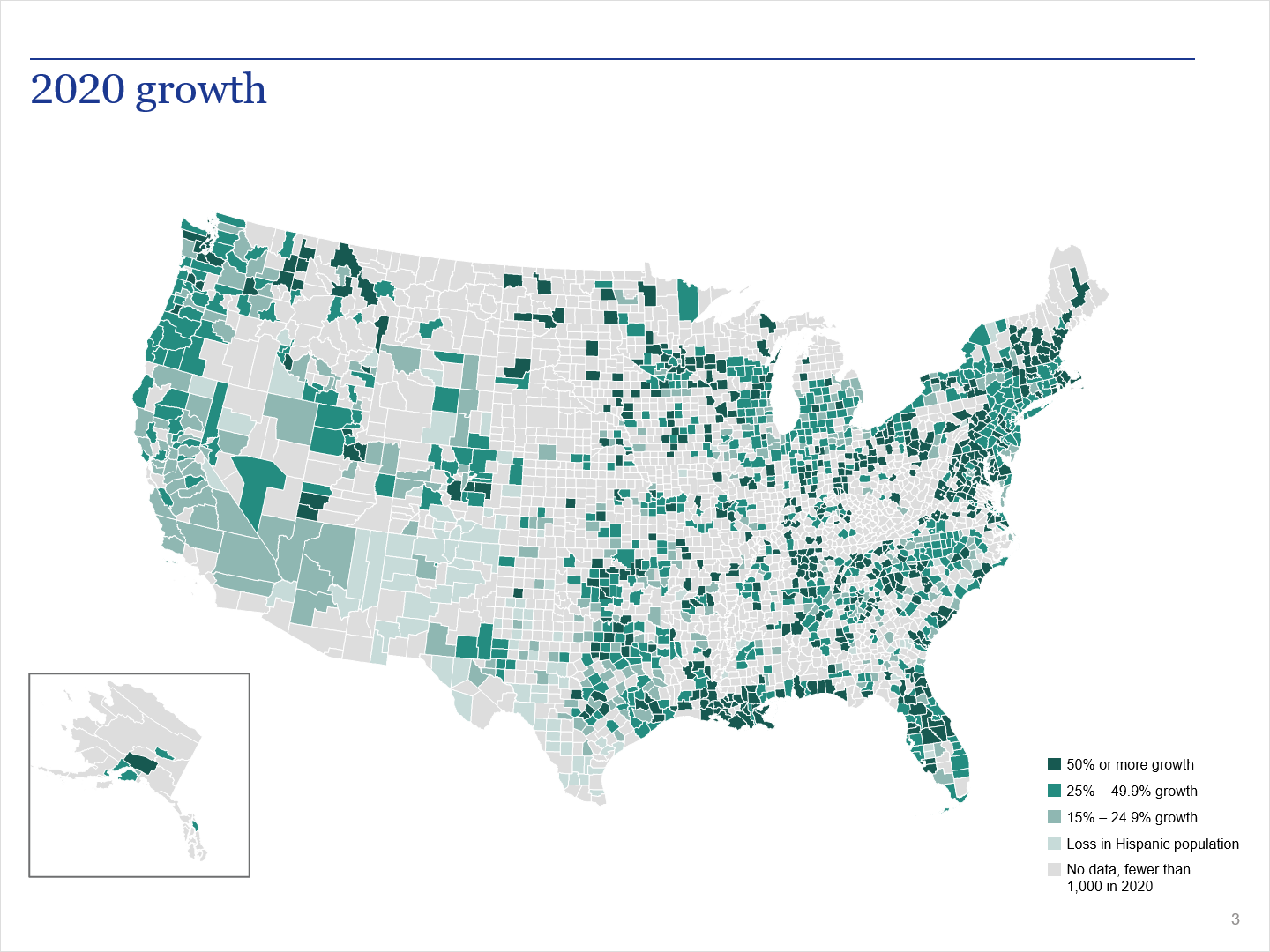
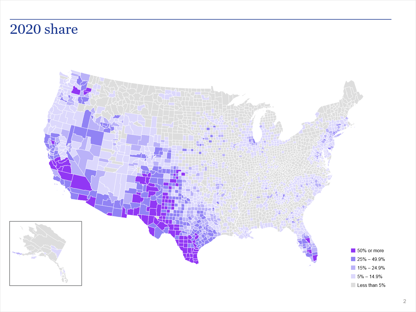
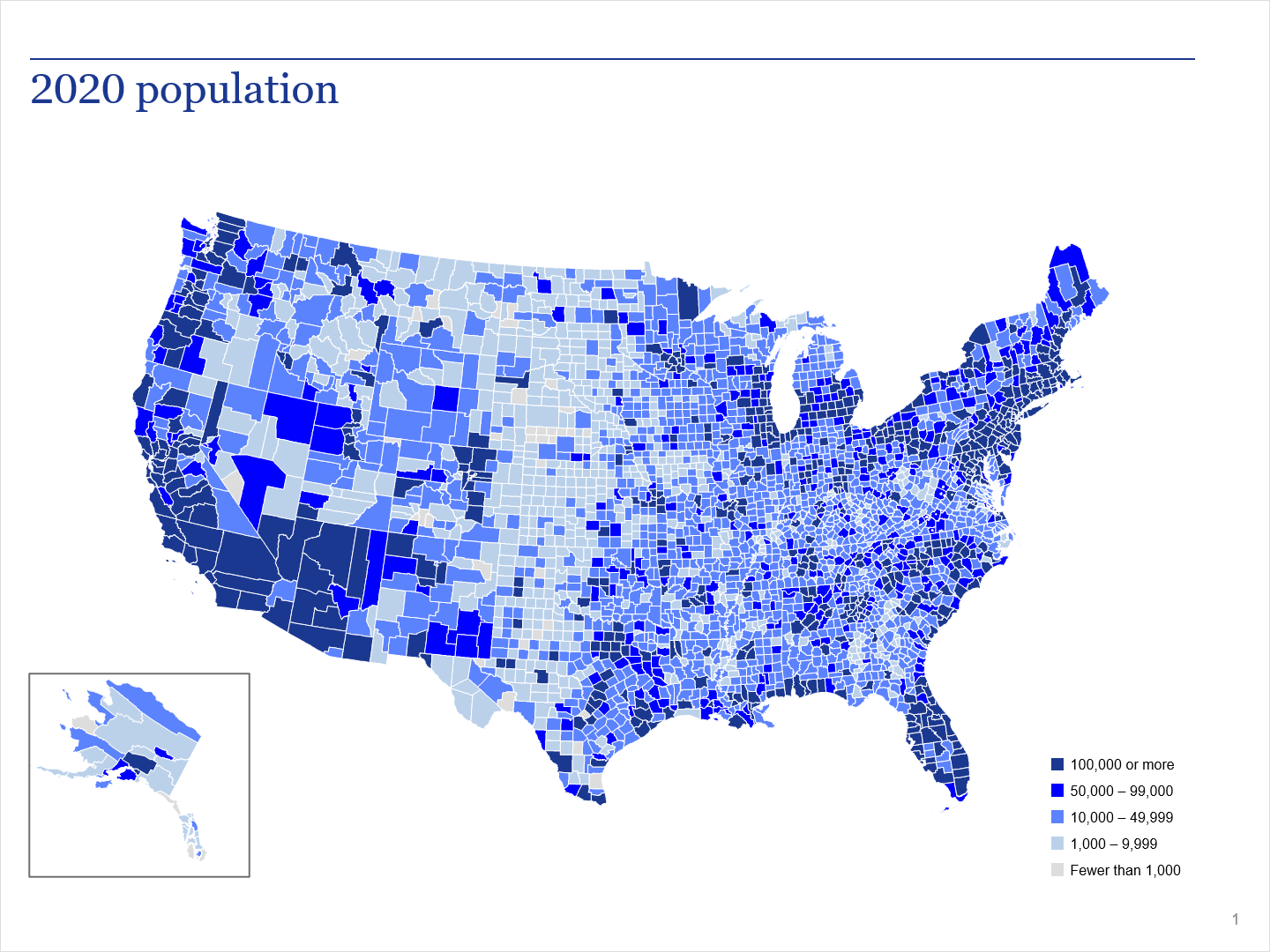
For the 05 design sample, we show you three basic illustrations of county maps. The maps are not basic though. They were all created in MapInfo, and they all came out great.
The 05 design
So, designing maps like these are pretty easy if you have the data and know how to create data queries. Otherwise, it could be a little challenging. If we ever get the chance, then we will create a tutorial on how to create one of these maps.
Now, all three maps represent the same company and sample demographic, just different metrics. For the purpose of these illustrations, we do not include the name of the company.
Illustrations
Here are some of the map illustrations for you to view.
Illustration 1

This illustration is so clean. We tend to export our maps in a vector-based format, which makes our maps look good. With range maps, it is necessary to create a legend. In fact, you probably want to create a legend first, so it will be easier to assign colors to each range.
Illustration 2

If we recall, illustration 2 represents the share of population. Of course, nice color selection. The color selection is from the client’s custom color scheme. Also, in a team effort, one purpose did the colors for the legend. Another person created the map.
Keep in mind, in MapInfo, you can automatically generate the range colors. So, you would assign a dark color for the top range, and MapInfo will generate the lighter shades.
Illustration 3

Illustration 3 came out great too. It represents the total population. The only thing you really can say is, there should be a better color separation between the top three ranges.
Special note: If we did not have the data for these charts, then we would have to create them by hand. Basically, coloring in each county. Now, that would be extremely tedious and take days to complete.
Related
- 01 design sample
- 06 design sample
- Designs by Artplotty Grid
- Fancy class schedule design in PowerPoint
- Featured designs


