The 01 design transforms an old creation into something more appealing. For the purpose of this creation, we made every inch of it in PowerPoint.
The 01 design
Before we get into details of the design, we need to show you the original.
The original
Take a look at the original creation below.
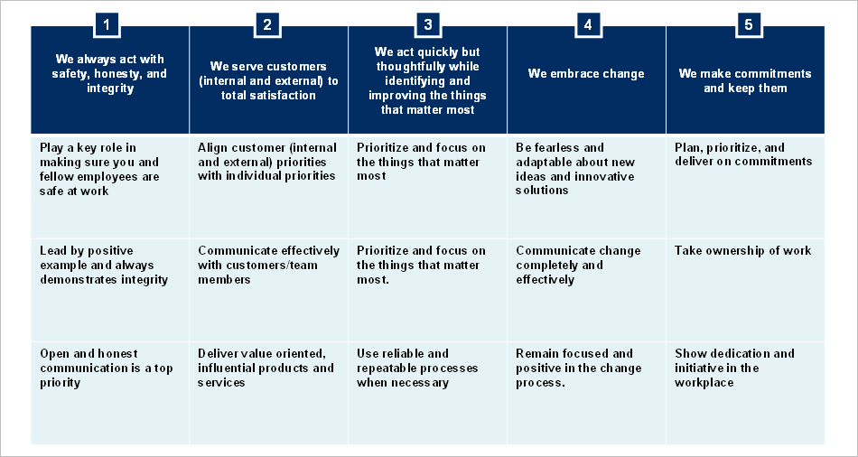
Overall, the original is not bad. The colors are decent, and it is pretty easy to follow. It is actually a PowerPoint table, which makes it pretty easy to update. Although it gets the job done, we took on the task of making it better.
The new designs
So, we made the decision to create three different versions of the original. It almost came to four, but we did not have the time to make that happen. Four was going to be super fancy.
Version 1
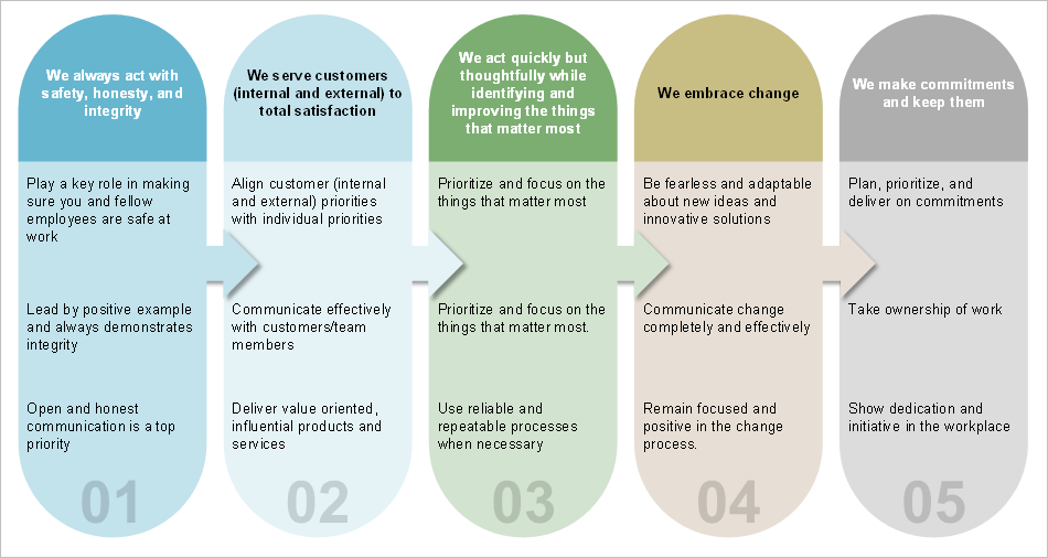
As you see, we use a softer palette. However, they were still in the color scheme that the client provided. So, these are rounded rectangles, with heading bars. Also, we put transparent number sequences at the bottom. It was kind of tricky keeping the shadow of the arrows off the box.
Version 2
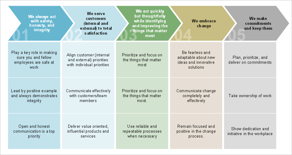
For version 2, we used chevrons and boxes. Again, the numbers are transparent. This time, we put them on the left of each chevron.
Version 3
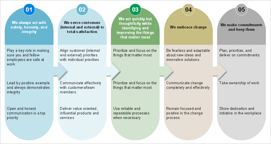
Version 3 is really the same as version 1, with exception to the transparent numbers.
