
How to design creative chart from financial news channel
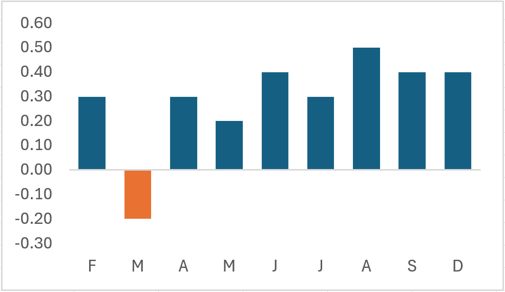
This tutorial shows you how to design creative chart from a financial news channel. Originally, we saw this kind of chart on CNBC. Thus, we think it would be a great idea to show people how to create it.
Overview
So, this design is nothing but a column chart with special formatting. Overall, it has two decorative elements – A solid cap and gradient fill color. That is what this chart is all about.
The main goal is to make this chart in a manner where all you have to do is enter data and watch it update. Of course, we also want the cap and gradient to update automatically.
For the purpose of this lesson, we will use Excel on a Windows PC to perform this task.
Quick refresher
If you need a refresher on how to create a column chart, then click on the link below.
Create a column chart in Excel – How to
The process
Start Excel and follow the steps below.
Step 1 – Enter the data
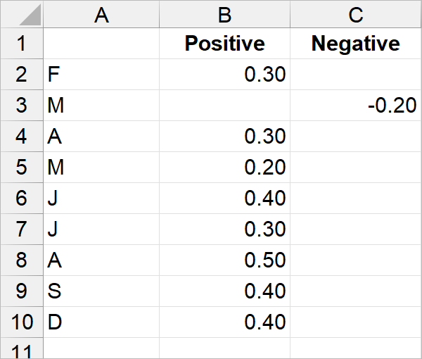
So, we decided to create two separate columns for the data. One column for positive values and another column for negative values. Thus, we will be able to select each series separately in the chart.
Step 2 – Select the data
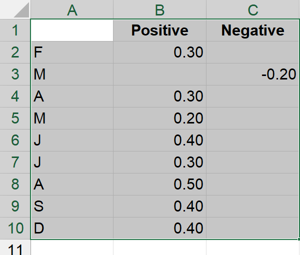
Firstly, only select that data to use for your chart.
Step 3 – Create column chart
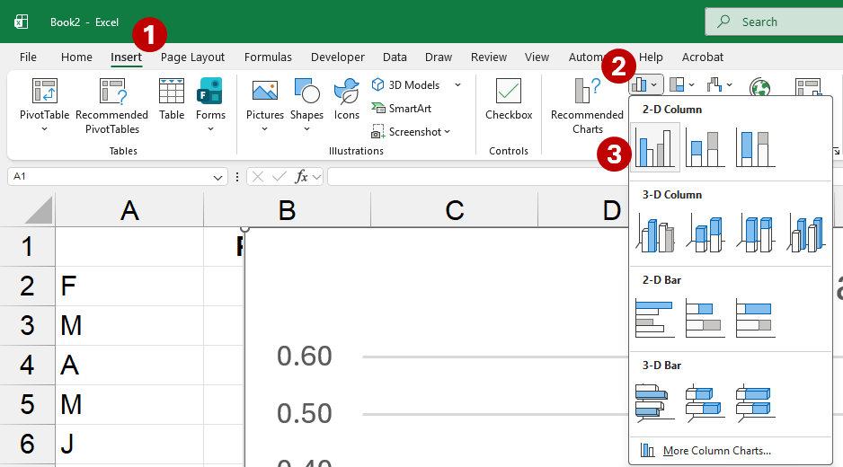
- From the menu, select Insert.
- Under the Insert ribbon, click Insert Column or Bar Chart from the Charts group. This will display a pull-down menu.
- Click Clustered Column from the 2-D Column category.
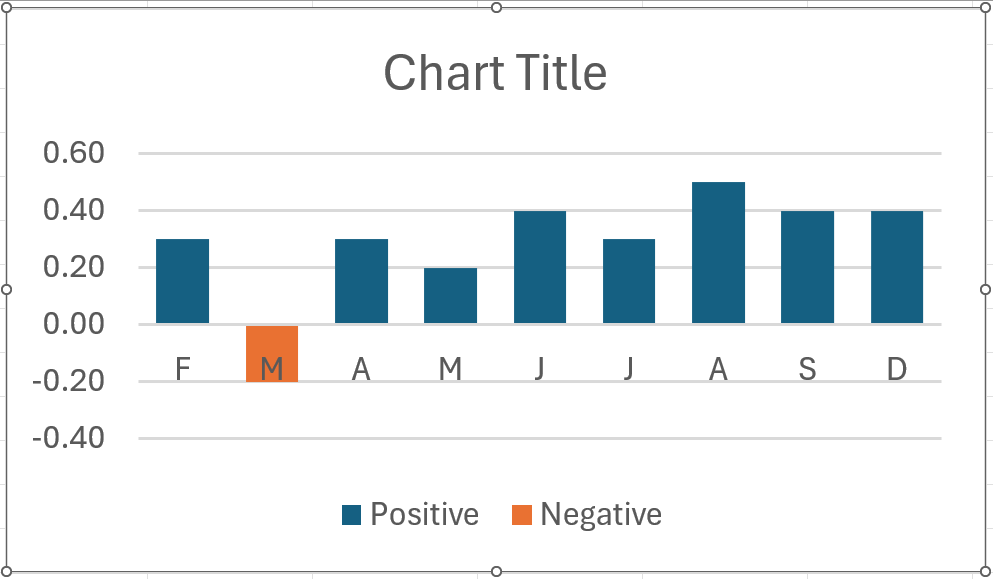
As a result, Excel inserts column chart for you, like the one shown below.
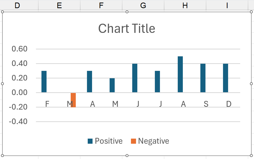
Since the chart thinks we will have positive and negative values side-by-side, it makes space for each missing column. Thus, you come up with a jagged look. All we have to do is fix the overlay.
Useful shortcuts for next section
Although we walk you through the process the long way, there are shortcuts to this. These two shortcuts are useful with charts and other objects in Excel.
- Right-click on an item to show click shortcut menu. Indeed, there will be an item at the bottom of the shortcut menu, allowing you to format the selected object.
- Select the object and press Crtl + 1, which will automatically display a dialog box to format current object.
Step 4 – Fix overlay
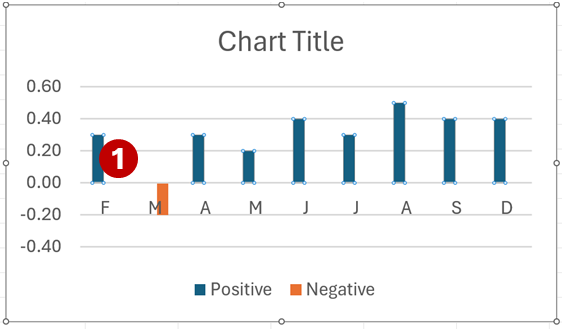
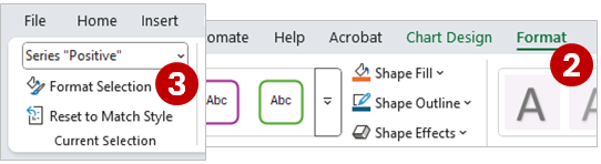
- Click on one of the columns on the chart. This should select the entire series.
- On the far right of the menu, select Format.
- From the Current Selection group, on the far left, click Format Selection. Note: Your selected series will appear in the selection box.
The Format Data Series dialog box appears on the far right of the screen. Additionally, the dialog may also float on the screen.
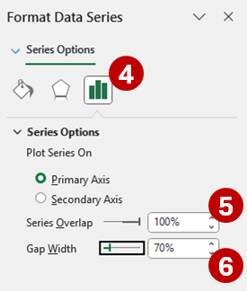
- Under the Format Data Series dialog, click Series Options icon.
- Change Series Overlap to 100%.
- Optional: Change Gap Width to 70%.
As a result, you get a healthier looking chart, like below.
Step 5 – Delete chart title, gridlines, and legend
In this example, we do not need the chart title, gridlines, and legend.
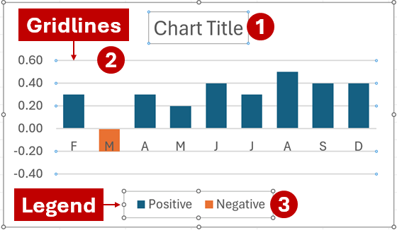
So, delete the following items: (1) Chart title, (2) gridlines, and (3) legend.
Simply click on each item and press Delete.
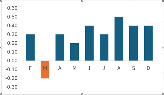
Now, you have an even cleaner chart, like below.
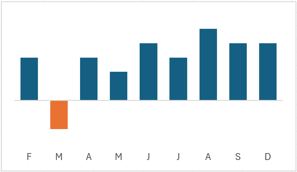
Step 6 – Move horizontal (category) axis down
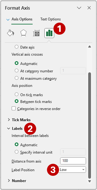
- Firstly, open Format Axis dialog box for horizontal axis and click Axis Options.
- Secondly, open Labels category.
- Thirdly, select Low for the Label Position.
Now, you can see the chart even better.
Step 7 – Hide vertical axis (y-Axis)
Instead of deleting the vertical axis, we want to hide it. Thus, we will still be able to easily access it, if necessary.
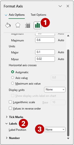
- Open Format Axis dialog box for vertical axis and click Axis Options icon.
- Scroll down and open Labels category.
- Select None for Label Position.
Depending on your chart, you may see a vertical line with no labels. Additionally, we can hide those. Remember, to not delete them.
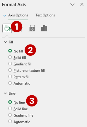
- Click Fill & Line icon at the top of Format Axis dialog box.
- Under Fill, check No fill.
- Lastly, select No line, under Line.
Almost suddenly, your chart is starting to look more like the opening image above.
Step 8 – Show data labels for columns
Since we have two series, you will have to perform the same task twice – for the Positive and Negative series.
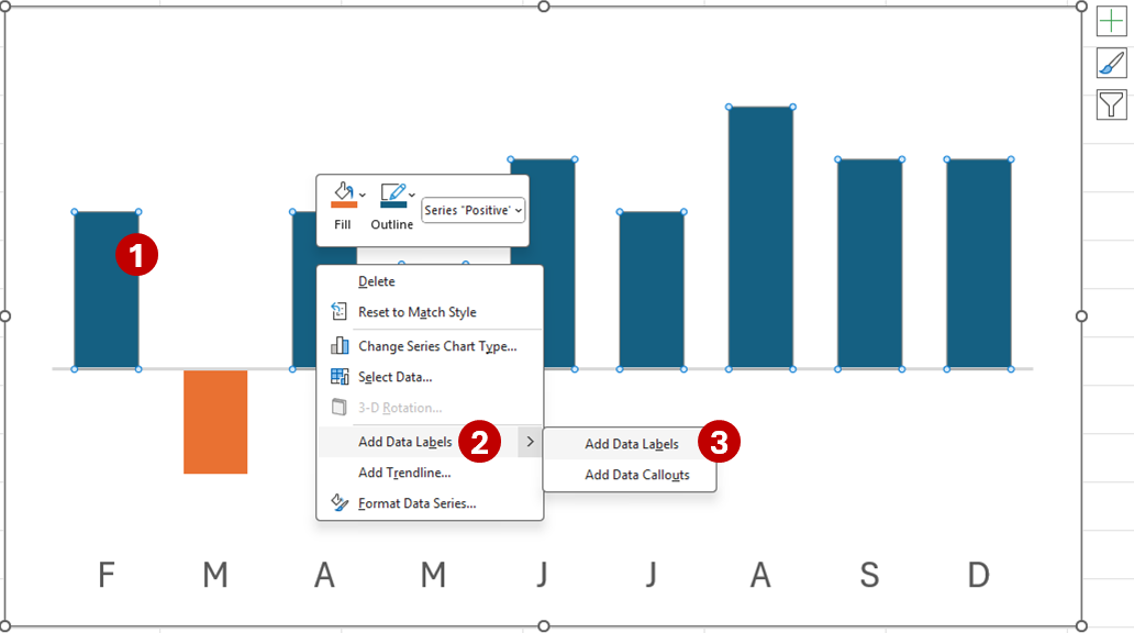
- Right-click on a series column.
- From the shortcut menu, select Add Data Labels.
- Then, select Add Data Labels from the side menu.
Remember, do it again for the other series.
Now that we have the chart ready, it is time for the meat and potatoes. Moreover, we will try to do all this in one dialog box.
Let us do the Positive values first.
Step 9 – Format positive values
Right-click on Positive series and select Format Data Series from the shortcut menu. After that, follow the steps below.
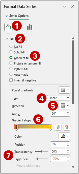
- Click Fill & Line from Series Options.
- Open Fill category.
- Check Gradient fill option.
- Select Linear for gradient Type.
- Pick Linear Down for gradient Direction.
- For both Gradient stops, use hex color code #ffc000. Or, RGB (255, 192, 0).
- For the first stop, set the Transparency to 50% and the Brightness to -70%.
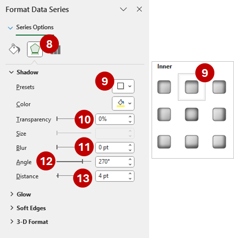
- Now, select Effects from Series Options.
- Under the Shadow category, for the Presets, select Inside: Top under Inner group.
- Set Transparency to 0%.
- Place Blur to 0 pt.
- Make the Angle 270 degrees.
- Set Distance to 4 pt.
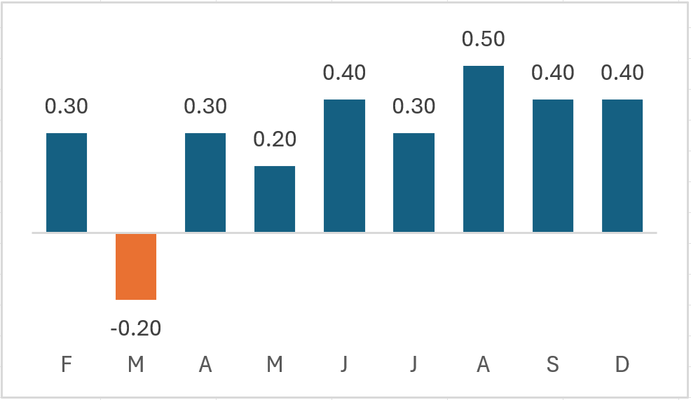
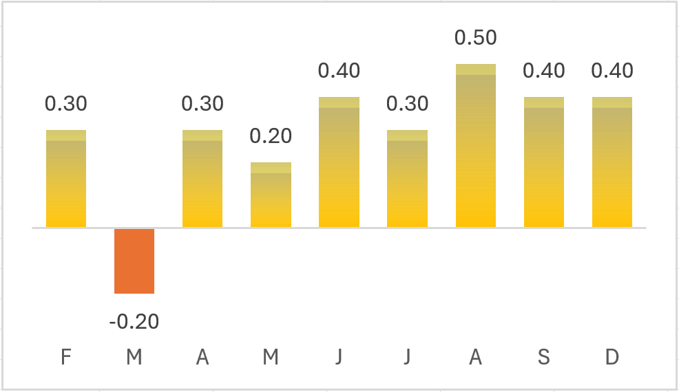
Your chart should now look like below.
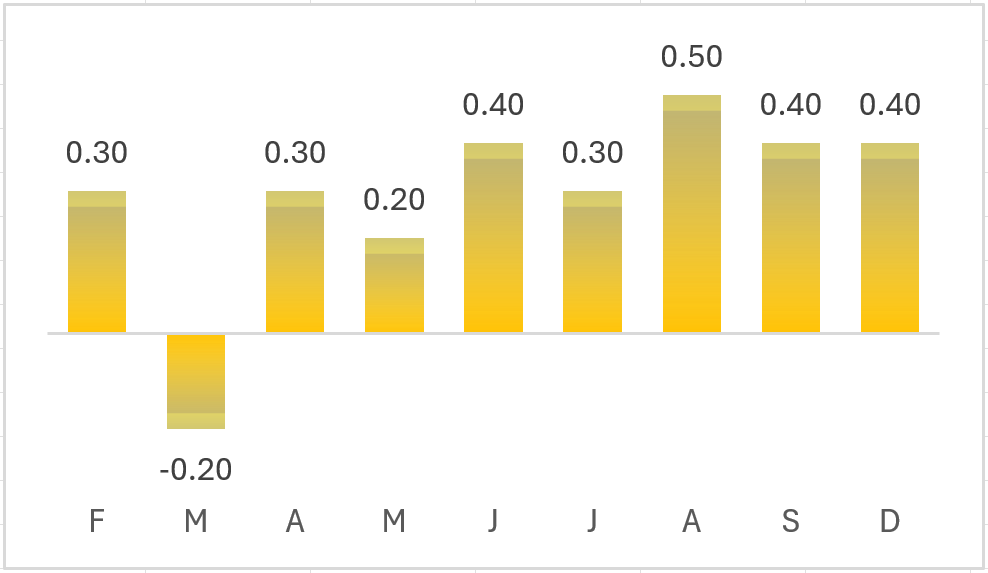
Follow the same process for the Negative series. However, you will format in the opposite direction. So, reverse the gradient stops and select Inside: Bottom for the shadow.
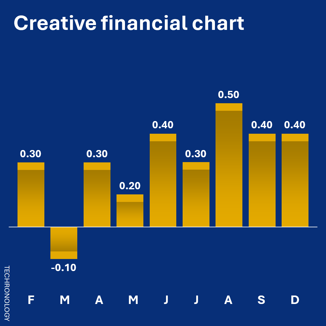
Below is the final chart.
Finally, the design creative chart is ready-to-go. Of course, feel free to change the color scheme and other features of the chart.
Success!
So, were you successful in the design creative chart process? If not, give it another shot.
Related
- Assign name to shape in Excel spreadsheet – How-to
- Create target line for Excel charts – How-to snapshots
- Draw lines in APG21 – How to
- Example skills and expertise resumé pages with Resume3x
- Link cells to shapes on Excel spreadsheet – How-to
- Update skills expertise in resume pitchbook – Resume3x – How to